In the December 24th 1999 edition of the Japanese Dreamcast Magazine, two short but insightful developer interviews were published as part of a 16-page special feature about Shenmue, serving to stir up excitement for the game's imminent release. The interviews themselves took place approximately 3 weeks prior to Shenmue's release in Japan at the end of December.
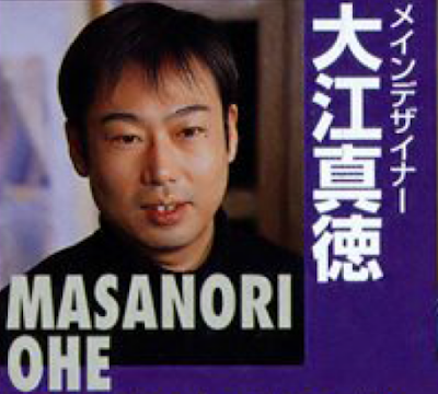
This post is a translation of the interview with Masanori Oe, who is credited as Shenmue's main designer.
 |
| Shenmue's main designer, Masanori Oe (also written Ohe) |
The article translation begins below.
Secrets of Shenmue
This is the first time that developers other than general director, Yu Suzuki, have talked about Shenmue. However, Shenmue has a surprisingly large number of developers under his supervision. A year has passed since the Premiere was held at the end of last year [note from Switch: 1998]. Now it's time to reveal the secret stories behind the making of Shenmue. This week, we focus on design and sound. I hope you can get a sense of the creativity and effort that have gone far beyond conventional methods of game production.
Interview with Main Designer - Masanori Oe
 |
| Masanori Ohe |
"Rather than worrying about whether a Saturn belonged there or not, we were more concerned with whether the Saturn's drive lid opens properly. And so, the Saturn's drive lid does open properly!" - Masanori Oe
About Masanori Oe
After working on the arcade game Winter Heat, he was chosen as the main designer for Shenmue about two years ago [note from Switch: around December 1997] and directed the game's overall design. The detailed backgrounds, passers-by, and the way they match with the scenery are not to be missed.
Dobuita Street's 7th Generation
 |
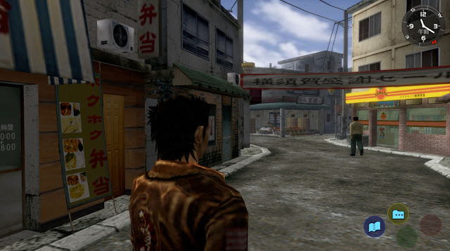
| Dobuita St [screenshot from the Shenmue I & II release] |
Yokosuka's Dobuita Street has actually been one of the game's locations ever since the prototype of Shenmue that was created on the Saturn. While the graphics of the game's first version wouldn't hold up if viewed now, the current version looks incredible. Note: this Dobuita Street is not the same as one in the demo version ["What's Shenmue"].
Modeling of Tens of Thousands of Kilometers of Terrain
 |
| Prologue [screenshot from the Shenmue I & II release] |
The prologue scene may seem unremarkable at first glance, but in fact, the terrain is modeled to the extent of several square kilometers. The grandeur and realism of the scene is achieved thanks to astonishing technology.
Graphics Which Have Raised the Game to a Whole New Level
Oe: First of all, to put it in an easy-to-understand manner, the Dobuita Street in the release version of Shenmue is the result of several generations of modeling. It's not so much that there are major changes from the demo version, but we've done things like slightly increasing the processing speed, and the graphics have become more detailed.
Q: What presented a challenge in designing Shenmue?
Oe: I'd have to say: making it realistic. That would be the greater part of it. To begin with, cityscapes are not that beautiful. One area may be grimy; another more like a shopping district. We really had a lot of trouble trying to create it all within the limited capacity available. We also had to think about how to make the players feel a sense of being there. We paid a lot of attention to every single detail, such as the lighting and the way the fog is rendered.
Q: Compared to the graphics at the Premiere a year ago, the graphics quality seems to have improved considerably over the past year, hasn't it?
Oe: Yes, that's true [laughs]. Even looking at them now ourselves, it's eye-opening to see how far they've come. That's because each team of designers was subdivided into smaller groups, and each team produced its own work. And when one team found a good method and produced outstanding graphics, the other teams quickly followed suit and raised their standards. So each time an improvement was found, it became the new standard. This "raising of the bar" led directly to Shenmue's increases in quality.
Q: Continuous improvement... Does that mean that you discarded the old data and remade it?
Oe: No, if we did that sort of thing, Mr. Suzuki would get mad! He'd say, "That's such a waste!" [laughs]. Rather, it would be a process of adding to the original data, such as adding more polygons, textures, and so on.
Q: Regarding how you interpreted "realism," what about one that is often-mentioned, that the Coca Cola vending machines contains something that's not from 1986?
Oe: That's a very perceptive observation [laughs]. It's just the Georgia can, though - everything else is from 1986*. However, one of the design team's principles - or policies, if you will - was to create things that were "cool". We certainly gave consideration to the period in which the game was set, but our final decisions were based on a coolness factor as well as realism. So, did everything absolutely have to be from 1986? Well, there were no detailed orders from Mr. Suzuki either. Rather than worrying about whether a Saturn belonged there or not, we were more concerned with how well the Saturn's lid opens. And so, the Saturn's lid does open properly! [laughs].
* Note from Switch: in the Japanese release, the vending machines contain the following drinks: Coca-Cola, Orange Fanta, Grape Fanta, Sprite and Georgia Coffee Original. These were replaced in overseas releases with Jet Cola, Fruda Orange, Fruda Grape, Jet Soda and Bell Wood's Coffee respectively. These can also be seen in the fan-made Shenmue Undub version.
 |
| Drink selection (Japanese release) |
 |
| Note from Switch: while "Georgia Coffee Original" did exist in 1986, the packaging had a different design as shown here. This design was used up until 1993. |
Q: When it comes to the graphics, what parts do you especially want people to look at?
Oe: I want people to pay attention to how naturally objects are portrayed. For example, in a game that uses polygons, you often see scenery in the distance suddenly appear out of nowhere, right? That's called pop-up. In Shenmue, however, the mountains in the distance are always there in the distance, and if you move closer to them, they naturally come closer to you. It's something we take for granted in our daily lives. So we never have buildings in the distance suddenly disappear or appear. We've reduced that issue to the absolute limit, close to zero. This was made possible not only by the skill of the designers, but also by the skill of the programmers. I'd like players to experience how natural it feels when watching the prologue scene [note from Switch: the prologue of Shenhua in Guilin], for example. In that scene, the terrain has been modeled over an area of several square kilometers, and is actually displayed in real time. Yet, it is not displayed blockily. I am sure this advanced rendering technology will be used effectively in Shenmue II as well.
Q: Speaking of Shenmue II, it's set is Hong Kong - a place that's famous for its night scenery. How will that aspect be?
Oe: Please look forward to it. It will be even more impressive than the footage that was shown at the Premiere. Shenmue II has plenty of great characters such as Ren, Shenhua, and Xiuying Hong. I think we'll be able to show something that will make you feel as if you were in Hong Kong!
-- End of translation --
Source: Dreamcast Magazine, 24th December 1999

No comments:
Post a Comment