A little over a year ago, Yu Suzuki was jointly interviewed with Katsuhiro Harada (of Tekken fame) and during this briefly spoke about a handful of original design documents for the Shenmue games he had brought along with him.
 |
| This photo accompanied an interview with Yu Suzuki & Katsuhiro Harada. Yu shows various Shenmue design documents, pointing here at what appears to be a sketch of a Chinese tulou. |
We have analyzed some of these design documents in earlier posts on this blog.
Related posts:
Today, the design document we will be examining is a concept sketch of the interior of a typical Hong Kong casual diner.
The document is headed "VF RPG", indicating that it was produced in the early design period of Shenmue, when the game was still known by its early working name of Virtua Fighter RPG.
It contains a single large illustration with hand-written annotations surrounding it, which I have translated.
Here is the translated design document [click to enlarge]:
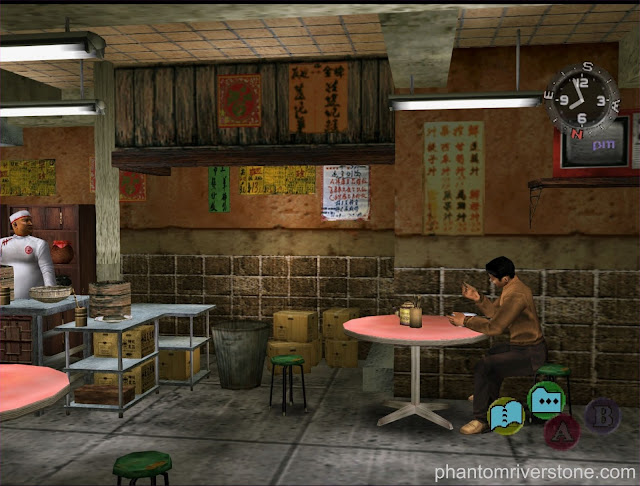
The atmosphere and layout portrayed in the sketch will feel immediately recognizable to players of Shenmue II, as Ryo has the occasion to visit several of these small eateries during his adventures in Hong Kong.
The many similar features include the style of round tables, each with a stand of chopsticks in the center;
the small four-legged stools scattered around;
the "worn-out" 14" red TV up in a corner of the room;
the fluorescent lighting (although suspended rather than attached directly to the ceiling beams);
and even details such as the patterning on this wooden frame:
To me, the handwritten design notes were one of the most interesting aspects of this document, providing some extra insight into the design process: the instruction that the stools should be distributed unevenly around the tables since the shop will look "too respectable" if are arranged neatly is quite amusing - and indeed, in the game they are placed rather haphazardly.
One of the annotations also suggests that the development team had originally discussed "reusing" a shop interior from Yokosuka (i.e. Shenmue I) in some way. This got me thinking about whether any of the restaurants in Dobuita would even be suitable: the most likely candidates would be the two Chinese restaurants, Ajiichi and Manpukuken Ramen.
I fired up Shenmue I to check out the interior of both these restaurants again, and...
There's the drink cooler from the design document, sitting in the corner! Not only that, but a worn-out red television can be found in both restaurants, identical to the one appearing in the Shenmue II diners.
So even if they did not reuse the whole of either shop's interior, they at least were able to get good mileage out of the old red TV.
I hope you enjoyed this peek at another design document. Did you notice any other similarities or differences in the concept sketch compared with the actual games?
* Follow the Phantom River Stone blog on Twitter and Facebook! *
Become a Patron!
Related posts:
- Yu Suzuki & Katsuhiro Harada Interview | Part 1 | DenFamiNicoGamer [26 Dec, 2016]
- Design Document: Tile-breaking Job
- Design Documents: "Gachinko Fishing" & "Washing Place"
Hong Kong Diner Interior
Today, the design document we will be examining is a concept sketch of the interior of a typical Hong Kong casual diner.
The document is headed "VF RPG", indicating that it was produced in the early design period of Shenmue, when the game was still known by its early working name of Virtua Fighter RPG.
It contains a single large illustration with hand-written annotations surrounding it, which I have translated.
Here is the translated design document [click to enlarge]:
 |
| "Hong Kong Diner Interior" design document |
 |
| The interior of Man Mo Restaurant in Shenmue II. |
 |
| Dou Jiang Diner in Shenmue II (whose furniture may not remain intact after Ryo visits). |
the small four-legged stools scattered around;
the "worn-out" 14" red TV up in a corner of the room;
the fluorescent lighting (although suspended rather than attached directly to the ceiling beams);
and even details such as the patterning on this wooden frame:
To me, the handwritten design notes were one of the most interesting aspects of this document, providing some extra insight into the design process: the instruction that the stools should be distributed unevenly around the tables since the shop will look "too respectable" if are arranged neatly is quite amusing - and indeed, in the game they are placed rather haphazardly.
One of the annotations also suggests that the development team had originally discussed "reusing" a shop interior from Yokosuka (i.e. Shenmue I) in some way. This got me thinking about whether any of the restaurants in Dobuita would even be suitable: the most likely candidates would be the two Chinese restaurants, Ajiichi and Manpukuken Ramen.
I fired up Shenmue I to check out the interior of both these restaurants again, and...
 |
| Manpukuken Ramen (Shenmue I) has an old red TV on a shelf (left) and a drinks cooler (right). |
So even if they did not reuse the whole of either shop's interior, they at least were able to get good mileage out of the old red TV.
I hope you enjoyed this peek at another design document. Did you notice any other similarities or differences in the concept sketch compared with the actual games?
* Follow the Phantom River Stone blog on Twitter and Facebook! *


Great insight Switch! I wonder if we will see that red TV again :D
ReplyDeleteThank you SeDGe! I'll totally be watching out in case it turns up in some of the Choubu restaurants :)
Delete